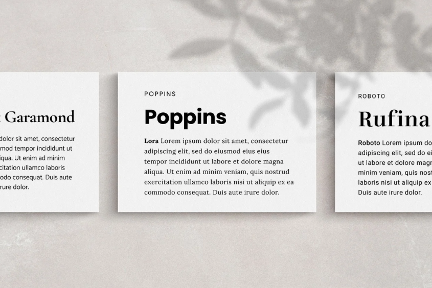
In the world of digital design and brand identity, typography serves as the silent ambassador of your brand, communicating tone, values, and professionalism before a single word is read. The art of font pairing—combining typefaces that complement rather than compete with each other—is crucial for creating harmonious, effective designs that guide the user experience and reinforce brand identity. Successful font pairings create visual hierarchy, enhance readability, and establish an emotional connection with your audience, making the difference between a forgettable interface and a memorable brand experience.
The Classic Serif and Sans-Serif Combination
One of the most timeless and reliable pairing strategies combines a serif font for headings with a clean sans-serif for body text. This approach creates immediate visual distinction between different content levels while maintaining overall harmony. The TT Ricordi and TT Commons Pro pairing exemplifies this classic combination beautifully. TT Ricordi, with its elegant serifs and refined proportions, brings sophistication and authority to headlines and display text, making it perfect for establishing brand presence and capturing attention. Meanwhile, TT Commons Pro provides the clean, highly readable sans-serif foundation necessary for comfortable reading of longer content. This combination works exceptionally well for brands in industries like finance, education, and professional services where trustworthiness and approachability must coexist.
See also: Telehealth: How to Access Healthcare From the Comfort of Your Home
Modern Sans-Serif Pairings for Contemporary Brands
For brands seeking a more modern, clean aesthetic, pairing two sans-serif fonts from the same family or with complementary characteristics can create a cohesive, forward-looking identity. The versatility of TT Commons Pro makes it an excellent candidate for such pairings, particularly when combined with TT Interfaces. Using TT Commons Pro Bold for headlines creates strong visual impact and immediate hierarchy, while TT Interfaces Regular serves as an excellent body font with its clean, geometric forms that ensure optimal readability. This combination delivers a professional yet contemporary feel that works well for technology companies, startups, and brands wanting to project innovation and efficiency. The key to success lies in maintaining sufficient contrast between the weights while keeping the overall aesthetic consistent.
Creating Distinctive Personality with Expressive Combinations
Some brands require typographic combinations that express more distinctive personality while maintaining professional integrity. Pairing a decorative or high-character font with a neutral workhorse creates balance between expression and functionality. TT Jenevers, with its unique flourishes and artistic character, can serve as an excellent display font for brands in creative industries, when paired with the straightforward functionality of TT Commons Pro for body text. This approach allows for distinctive branding elements while ensuring that extended content remains accessible and readable. Similarly, TT Tunnels’ bold, industrial character can make a powerful statement in headlines when balanced with the clean neutrality of TT Interfaces for supporting text. These combinations work particularly well for lifestyle brands, creative agencies, and companies wanting to stand out in crowded markets.
Establishing Hierarchy Through Weight and Scale
Beyond mixing different typefaces, effective pairing can be achieved within a single font family by leveraging its weight and style variations. TT Commons Pro offers an extensive range of weights that allow designers to create a clear hierarchy without introducing additional typefaces. Using TT Commons Pro Black for main headlines, TT Commons Pro Medium for subheadings, and TT Commons Pro Regular for body text creates a cohesive yet clearly structured typographic system. This monofamily approach ensures perfect harmony and consistency across all brand applications, from digital interfaces to printed materials. The result is a professional, polished appearance that reinforces brand recognition through typographic consistency.
Conclusion
Successful font pairing is both an art and a science that requires understanding contrast, harmony, and brand alignment. The most effective combinations create clear visual hierarchy while maintaining overall cohesion, ensuring that typography enhances rather than distracts from the content. Whether opting for the classic serif-sans combination of TT Ricordi and TT Commons Pro, the modern approach of TT Commons Pro with TT Interfaces, or more expressive pairings that incorporate distinctive fonts like TT Jenevers, the principles remain consistent: ensure sufficient contrast for hierarchy, maintain harmony through shared characteristics, and always prioritize readability.